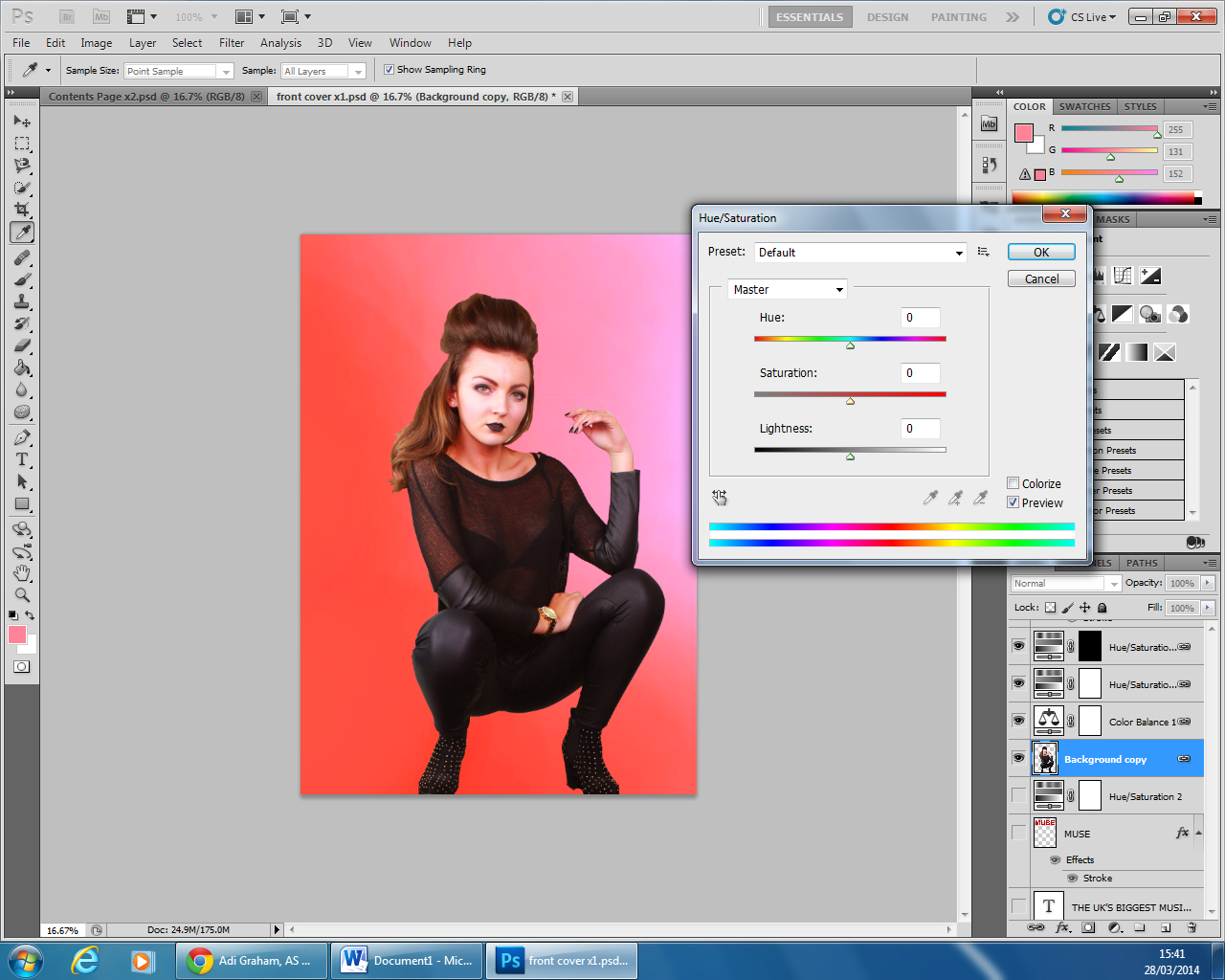
In the process of creating my magazine front cover, I began by using the large brush tool and creating a background which I felt would allow the features on my front page to stand out. Also, I chose to create the background colour quite red, which was a colour associated with rock magazines and has connotations of danger. However, I also added the effect that the red would transition into a lighter red/pink. This is because this particular magazine issue is dominated by a female artist, so therefore shows the feminine side to the magazine.
Once I had cut around the original image, I placed her in the center of the page and enlarged her so that her feet were against the bottom line of the page.

I felt that due to the flash of the camera, the models face was white in contrast to the rest of her body so decided to increase the saturation of her, to create a better effect.
In order to create my masthead, I researched into other rock music magazines and came across the continuation of big bold fonts. Therefore, I also decided to create my text very large at the top of the page so that it one of the first things the reader sees and grasps their attention. Furthermore, I decided on creating the headmast a dark red which contrasted with the lighter background so it stands out. Although I wanted the model to cover some of the headmast, which shows her as being more dominant, and as my magazine is popular, the audience is expected to know what the headmast reads, even though a fraction of it is hidden.
The next thing that I created were the artists that I wanted to feature in my magazine. I created the cover lines with the artists' names on in several creative ways, to see which design I preferred them. Therefore I came to the conclusion that I wanted the text white and highlighted black, as these two colours contrast against each other which allows the text to stand out and makes it easier for the audience to read. I chose the black higlights as it matches her costume, and therefore shows a colour theme emerging and creates the magazine to appear more professional.
I then began to insert other cover lines positioned around the main image. To do this, I browsed through different fonts to see which appealed to me the most and appeared effective for a rock magazine. After, I came to the decision of three different font styles for my cover lines, so that they created a range of different styles to the cover but also the magazine appeared professional and organised.
I then included two sell lines, one at the top of the magazine and the other across the bottom. I found that these were a common feature on music magazines when I researched them, and so I therefore decided to include them on my cover, to make it appear more conventional. I created the sell lines to entice the audience to read the magazine, such as the sell line at the top of the page promotes the magazine with the superlative adjective 'biggest', is larger than the rest of the line, catching the audiences attention and showing just how important the magazine is. As well as the sell line at the bottom of the page, providing an offer which attract the audience. This is emphasised by 'plus' being a different coloured text then the rest.
To create the barcode and phone barcode, I researched images that I could use and edited them on photoshop. I changed the design of them so that there would be no copyright intended and cut them out so that I could place them on my magazine.
Finally, I decided to add a plug to my magazine cover for the finishing detail. I used various tools on photoshop including, the shape, text and colour fill tool to create a plug that would stand out to the reader and promote an offer for them to win tickets, therefore persuading the reader to buy the magazine. I chose to have the plug yellow as it is bright and eye catching and so will be one of the first things that the reader notices, as well as it being the same colour as the pull quote and part of the sell lines, therefore showing a colour theme to the magazine and creating it to look professional and organised. However, I felt that the plug also needed something else to help it stand out, so by clicking on the 'fx' tool. I created a black stroke around the edge to create a 3D appeal and allow the plug to stand out even more.


No comments:
Post a Comment