Friday, 11 April 2014
Q1: In what ways does your media product use, develop or challenge forms and conventions of real media products?
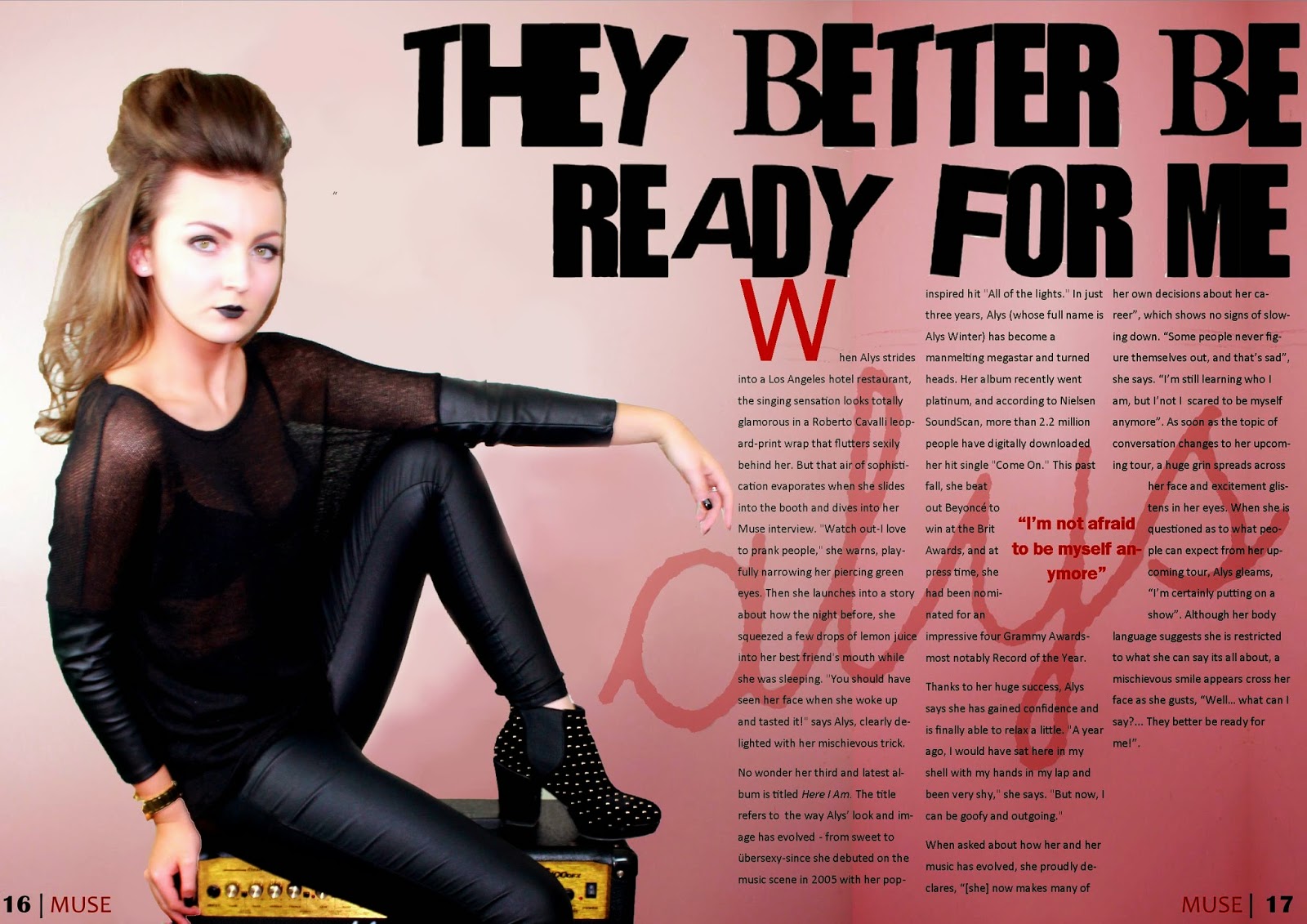
Throughout the production process of my magazine, creating my font page, contents page and double page spread, I have created continuity throughout, for example creating a house style with a colour scheme. I decided to use a colour scheme of: red, black, white and yellow, which I have continued onto all of my magazine pages to create my magazine to look aesthetically pleasing and to bring it all together. I chose to use these colours because I researched into magazines with the same music genre as mine, and found that it was conventional and a similar selection of colours were used. Also, I felt that red, black and white are all associated with rock and have connotations of danger, with the added inclusion of yellow, allowed aspects of my magazine to stand out and catch the audiences attention. Another feature to create the house style, was placing my main model on all three of my products to reinforce her importance as the main artist, across the magazine and to maintain the magazine genre to the audience.In addition, I have also used the same type of fonts across all three features, of being bold and creating a powerful, to reinforce the dominance of my magazine. If i did not continue this house style onto all of the features of my magazine, then it would appear unprofessional and inconsistent, and the importance of my main artist and the magazine would not be reinforced.
Q2: How does your media product represent particular social groups?
I also made the decision to produce a series of interviews for members of the audience who would read my magazine and to see who the main type of audience are and if I have targeted them effectively.
1. What is your age and gender?
2. What is your current working status?
3. What is your social grade?
4. What are your key interests?
5. How do you feel about the price of my magazine?
6. Do you feel as engaged to my magazine as you would other existing rock magazines?
7. What features specifically attract you to my magazine?
8. Do you think my magazine has a clear house style and colour theme and how effective do you think they are?
Q3: What kind of media institution might distribute your media product and why?
Media Institutions by rubymoore08x on GoAnimate
Bauer Media:
 Bauer media is a division of the Bauer Media Group, Europe's largest privately owned publishing Group. The group is a worldwide media empire offering over 300 magazines in 15 countries, as well as online, TV and radio stations, demonstrating that they are a global company. It is a multi-platform UK based media group which is widely recognised and rewarded as being industry innovators.
I think Bauer media would be effective distributors because they have a lot of experience in the industry and are very popular. Therefore they will promote my magazine well and create a positive reputation for my magazine.
In addition there slogan 'we think Popular' shows that they are seen as a very popular institution and distribute to a large population and shows that their primary purpose is to be popular, so this is essential for distributing my magazine.
These are some of the brands that the Baeur media group cover distribute. This appeals to me as they cover several existing products which I used as influences for my own magazine such as Q. As magazines such as Q and Kerrang are very popular magazines worldwide, this shows that Bauer are a successful institution.
With more than 60 iconic media brands, IPC creates content for multiple platforms, across print, online, mobile, tablets and events. As the UK's leading consumer magazine publisher they engage with 26 million UK adults - almost two thirds of UK women and 42% of men. They also have an award winning portfolio of websites which reach over 25 millions users globally every month. They are committed to working in partnership with its consumers, advertisers, business partners and employees to deliver exceptional value, service, innovation and creativity.
I think that IPC Media would be a good institution to distribute my magazine because they have a huge fan base and reach their target audience in many different formats. Therefore my magazine would be accessible across the globe and a widespread of individuals.
Here are some of the brands that IPC media group distribute. They do cover various popular music magazines such as NME. This shows they have experience working with top music brands and have dominance within the market.
Chosen Media Institution:
The media Group that I have decided to choose for my magazine and to distribute my products is Bauer media. I decided on this because of their experience with other existing products such as Q which my magazine was influence from. In addition, I think my products would fit in with other existing products.
Here I have placed my magazine amongst other Bauer existing products to compare. When putting the magazines side by side, I think that my magazine cover fits in well with the others and the Bauer media style, and as the existing magazines are very successful I think Muse would be able to achieve the same, with Bauer media being its institution. The only problem that I would face would be the tough competition between these other successful products, but at least my product would be distributed globally and gather a wide fan base.
How I want my product to be distributed:
In relation to the distribution of my media product, I would like product to be made very accessible so that it can reach a widespread audience and introduces a lot more people to it. In addition, the most popular magazines of the current society are also available on portable devices and technology as well as hard copies, therefore I would like my product to also be distributed digitally as there has also been an increase in proliferation and convergence.
For example, all of the mainstream music magazines also have a website for members of the audience to access. This is very effective when communicating with the public audience as people from all over the globe can access their websites, shown in the screenshots below.
However, as some of the audience still purchase products physically, I would want my products to be distributed to leading supermarkets, as a majority of people will shop in these places, and will so therefore come across my products and easily be able to access them.
Q5: How did I attract/address my audience?
Questions for audience feedback:
1. What is your age and gender?
2. What is your social grade?
3. Who do you think my magazine is aimed at and why?
4. What genre do you think my magazine is?
5. Do you think my magazine appears as conventional as other existing products and why?
6. Do you think my magazine appeals to both genders?
7. When comparing my product to an existing product, what magazine would you say represents mine?
8. Do you think my magazine has a house style and colour theme?
I also created a closed-ended questionnaire survey which I handed out to various peers, so that I could receive even more valid feedback to support who my magazine's target audience is.
The questions that I asked are:
1. Do you find my magazine attractive and appealing to read?
2. Does my magazine appear as professional and conventional as other existing products?
3. Do you feel my magazine fits in well with other rock magazines?
4. Do you think my magazine has a clear house style?
5. Are the images on my magazine appealing to you?
6. Are you drawn to the features on my magazine and do you find them effective?
7. Do you think my magazine appeals to a younger audience?
8. Do you think the genre of my magazine is reflected effectively?
9. Are you attracted to the colour theme of my magazine?
The individuals that I asked include:
Josie Mumby, 17, Female
Emily Abba, 18, Female
Sarah Phillips, 22, Female
Jack Conman, 23, Male
Eddie Moxon, 18, Male
Charlie Pickering, 19, Male
Questionnaire feedback:
Once I had collected in the results of my questionnaire; I created a tally chart, so that I could see and present my results in a clear way. Overall I was pleased with the feedback that I collected; although I did receive a few negative feedback, yet these could be due to personal reasons, as the majority was positive. With the individuals that gave me the negative feedback, they also stated a reason for why they answered 'no' and their reasons were mainly due to the colour theme including pink, which is not a stereotypical colour associated with the rock genre and also does not attract males, as much as females. However, I have already analysed this in my evaluation.
Q6: What have you learnt about technologies from the process of constructing the product?
Before I began my coursework, there were many technology programmes that I had not used before, these include: Photoshop, Blogger, photography studio lights, Prezi, and GoAnimate. I have also learnt how to use new software and without these I would not be able to produce my final product that I did.
Photoshop:
I had never used Photoshop before and it was essential to when constructing my magazine products. I experimented with the software and quickly learnt and adapted to using it for all of my editing and majority of my production process. I found the programme very useful as there were many different tools for different uses which allowed me to create my products in effective and creative styles. The following images show the key tools I used throughout the process.
Q7: Looking back at your preliminary task, what do you feel you have learnt in the progression from it to full product?
Preliminary task; college magazine: Final product - music magazine:
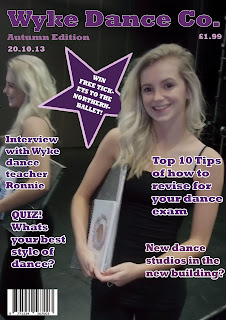
At the beginning of the course I created a college magazine front cover for my preliminary cover. The purpose of this was to become familiar with the technologies I would be using and also to help prepare myself for the final products.
The preliminary task:
When creating my preliminary task I learnt a lot terminology, skills, how to use technology, researching process and techniques which would help me design my final product.
Research process
However, when looking back at my preliminary task, I felt that my front cover had many unconventional features; such as:
Consequently, from this self evaluation, I have learnt from my mistakes and improved and developed my learning of magazine conventions for my final product.
This is evident when I have compared my magazine conventions:
When I look back at my preliminary task I feel I have improved hugely to my final product. I have learnt and developed many skills, which has lead to producing a more conventional and professional final product.


At the beginning of the course I created a college magazine front cover for my preliminary cover. The purpose of this was to become familiar with the technologies I would be using and also to help prepare myself for the final products.
The preliminary task:
When creating my preliminary task I learnt a lot terminology, skills, how to use technology, researching process and techniques which would help me design my final product.
- Terminology
- Skills
Research process
I also developed techniques into providing thorough research into existing products, target audience and planning. Such as I have learnt how to create: moodboards, LIIAR analysis', conventions, institution and artists research etc.
However, when looking back at my preliminary task, I felt that my front cover had many unconventional features; such as:
Consequently, from this self evaluation, I have learnt from my mistakes and improved and developed my learning of magazine conventions for my final product.
This is evident when I have compared my magazine conventions:
When I look back at my preliminary task I feel I have improved hugely to my final product. I have learnt and developed many skills, which has lead to producing a more conventional and professional final product.
Wednesday, 2 April 2014
Evaluation
The evaluation should be seen as a creative task and the potential of the format chosen should be exploited through the use of images, audio, video and links to online resources.
In the evaluation the following seven questions must be addressed:
In the evaluation the following seven questions must be addressed:
- In what ways does your media product use, develop or challenge forms and conventions of real media products?
- How does your media product represent particular social groups?
- What kind of media institution might distribute your media product and why?
- Who would be the audience for your media product?
- How did you attract/address your audience?
- What have you learnt about technologies from the process of constructing this product?
- Looking back at your preliminary task, what do you feel you have learnt in the progression from it to the full product?
Front Cover step by step guide
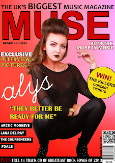
In the process of creating my magazine front cover, I began by using the large brush tool and creating a background which I felt would allow the features on my front page to stand out. Also, I chose to create the background colour quite red, which was a colour associated with rock magazines and has connotations of danger. However, I also added the effect that the red would transition into a lighter red/pink. This is because this particular magazine issue is dominated by a female artist, so therefore shows the feminine side to the magazine.
Once I had cut around the original image, I placed her in the center of the page and enlarged her so that her feet were against the bottom line of the page.
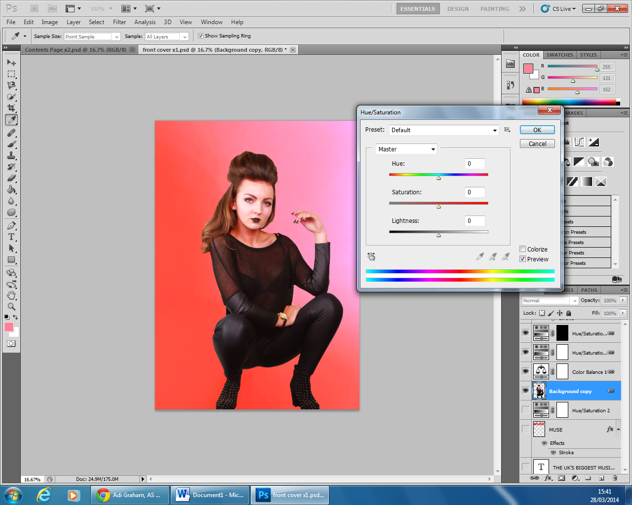
I felt that due to the flash of the camera, the models face was white in contrast to the rest of her body so decided to increase the saturation of her, to create a better effect.
In order to create my masthead, I researched into other rock music magazines and came across the continuation of big bold fonts. Therefore, I also decided to create my text very large at the top of the page so that it one of the first things the reader sees and grasps their attention. Furthermore, I decided on creating the headmast a dark red which contrasted with the lighter background so it stands out. Although I wanted the model to cover some of the headmast, which shows her as being more dominant, and as my magazine is popular, the audience is expected to know what the headmast reads, even though a fraction of it is hidden.
The next thing that I created were the artists that I wanted to feature in my magazine. I created the cover lines with the artists' names on in several creative ways, to see which design I preferred them. Therefore I came to the conclusion that I wanted the text white and highlighted black, as these two colours contrast against each other which allows the text to stand out and makes it easier for the audience to read. I chose the black higlights as it matches her costume, and therefore shows a colour theme emerging and creates the magazine to appear more professional.
I then began to insert other cover lines positioned around the main image. To do this, I browsed through different fonts to see which appealed to me the most and appeared effective for a rock magazine. After, I came to the decision of three different font styles for my cover lines, so that they created a range of different styles to the cover but also the magazine appeared professional and organised.
I then included two sell lines, one at the top of the magazine and the other across the bottom. I found that these were a common feature on music magazines when I researched them, and so I therefore decided to include them on my cover, to make it appear more conventional. I created the sell lines to entice the audience to read the magazine, such as the sell line at the top of the page promotes the magazine with the superlative adjective 'biggest', is larger than the rest of the line, catching the audiences attention and showing just how important the magazine is. As well as the sell line at the bottom of the page, providing an offer which attract the audience. This is emphasised by 'plus' being a different coloured text then the rest.
To create the barcode and phone barcode, I researched images that I could use and edited them on photoshop. I changed the design of them so that there would be no copyright intended and cut them out so that I could place them on my magazine.
Finally, I decided to add a plug to my magazine cover for the finishing detail. I used various tools on photoshop including, the shape, text and colour fill tool to create a plug that would stand out to the reader and promote an offer for them to win tickets, therefore persuading the reader to buy the magazine. I chose to have the plug yellow as it is bright and eye catching and so will be one of the first things that the reader notices, as well as it being the same colour as the pull quote and part of the sell lines, therefore showing a colour theme to the magazine and creating it to look professional and organised. However, I felt that the plug also needed something else to help it stand out, so by clicking on the 'fx' tool. I created a black stroke around the edge to create a 3D appeal and allow the plug to stand out even more.
Friday, 28 March 2014
Thursday, 27 March 2014
Tuesday, 25 March 2014
3rd Front Cover Draft
Here I have changed the gold plug and some text to yellow, as it is more conventional to have a colour theme of three colours. Also I have changed the barcode layout, so that it has more features. In addition, I felt the artist cover lines in this position was a lot more effective and made the magazine appear more organised.
Wednesday, 19 March 2014
Monday, 17 February 2014
Subscribe to:
Comments (Atom)


